UI
In Marmot, you can create UIs to be serialized and sent to the client.
| ⚠️ | Due to Marmot’s age, some things may be buggy and not work properly. We are working on solving these issues as fast as possible. |
|---|
In Kotlin, a UI can be created like this:
class TestUI : MarmotUI("test_ui") { fun new() {}}| ‼️ | Because of the layout-based nature of Marmot’s UI system, you must add components into groups. |
|---|
Most of the time, a component expects an ID in its first parameter. Using duplicate IDs will cause issues, so make sure to look out for that.
Inside the new() function, you can add components:
class TestUI : MarmotUI("test_ui") { fun new() { group("test_group") { text("test_text") { text = "Hello World" anchor = Anchor.CENTER_CENTER // horizontal_vertical } } }}In order to send a UI to a player/audience, you must do this:
val ui = TestUI()player/audience.openUI(ui.new())Animations
Section titled “Animations”Marmot also supports UI animations, for example:
class TestUI : MarmotUI("test_ui") {  fun new() {    group("test_group") {      val text1 = text("test_text") {        text = "Hello World"        anchor = Anchor.CENTER_CENTER // horizontal_vertical      }
      text1.schedule(20) { // 20 ticks from now        // You can run multiple animations at once, hence the list.
        // This will move the text to 50,50 from the player's crosshair        // (since it's anchored to CENTER_CENTER), and reduce its opacity        // to 0.5 (50%) over the course of 0.5 seconds.        listOf(          move(            to = Vec2(50f, 50f),            duration = 0.5,            easing = Easing.LINEAR          ),          opacity(            opacity = 0.5f,            duration = 0.5,            easing = Easing.EASE_IN_OUT          )        )      }    }  }}
Easing
Section titled “Easing”Marmot currently supports 24 easing variants:
enum class Easing { LINEAR, EASE_IN, EASE_OUT, EASE_IN_OUT, EASE_IN_CUBIC, EASE_OUT_CUBIC, EASE_IN_OUT_CUBIC, EASE_IN_QUINT, EASE_OUT_QUINT, EASE_IN_OUT_QUINT, EASE_IN_BACK, EASE_OUT_BACK, EASE_IN_OUT_BACK, EASE_IN_ELASTIC, EASE_OUT_ELASTIC, EASE_IN_OUT_ELASTIC, EASE_OUT_BOUNCE, EASE_IN_BOUNCE, EASE_IN_OUT_BOUNCE, EASE_IN_SINE, EASE_OUT_SINE, EASE_IN_OUT_SINE, EASE_IN_EXPO, EASE_OUT_EXPO, EASE_IN_OUT_EXPO}Most of these can be found and visualized here, and you can also see how they work here on the client.
You can also nest schedulers inside each other, which could look something like this: (before 1.2.12, this functionality was broken!)
text1.schedule(20) { // 20 ticks from now    text2.schedule(5) { // 25 ticks from now        text3.schedule(50) { // 75 ticks from now
        }
        text4.schedule(10) { // 35 ticks from now
        }    }}
Relative Positioning
Section titled “Relative Positioning”Components can be placed relatively to each other in Marmot.
| ⚠️ | Due to Marmot’s age, relative positioning is still a work in progress, however, left and right positioning are functional. |
|---|
When components are relative, the pos still works as expected, adding the pos onto the relative position.
Example:
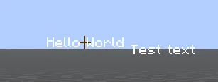
class TestUI : MarmotUI("test_ui") { fun new() { group("test_group") { val text1 = text("test_text") { text = "Hello World" anchor = Anchor.CENTER_CENTER // horizontal_vertical } val text2 = text("test_text_2") { text = "Test text" } rightOf text1 } }}The result:
You can also give any component padding, and text components background and text color:
class TestUI : MarmotUI("test_ui") {  fun new() {    group("test_group") {      val text1 = text("test_text") {        text = "Hello World"        anchor = Anchor.CENTER_CENTER // horizontal_vertical      }      val text2 = text("test_text_2") {        text = "Test text"        /*          You can control the padding more strictly.          For example:          padding = Spacing(x = 5) // applies 5 pixels of padding on the left and right          padding = Spacing(left = 5, right = 5) // works the same as x = 5
          padding = Spacing(y = 5) // applies 5 pixels of padding on the top and bottom          padding = Spacing(top = 5, bottom = 5) // works the same as y = 5        */        padding = Spacing(5) // applies 5 pixels of padding on every axis
        backgroundColor = UIColor(255, 255, 255)        color = UIColor(0, 0, 0)      } rightOf text1    }  }}
Sprites (textures)
Section titled “Sprites (textures)”In Marmot, sprites are very easy to add:
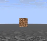
class TestUI : MarmotUI("test_ui") { fun new() { group("test_group") { val sprite = sprite("test_sprite") { texturePath = "textures/block/dirt.png" } } }}| ‼️ | As of now, the .png is still required, but will definitely be optional in a future update. |
|---|
| ℹ️ | The texturePath is simply a path to a resource. You can add a custom namespace like my_pack:textures/item/something_cool.png from a resource pack. The namespace defaults to minecraft if one is not found. |
|---|
The result:
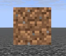
The size on the X and Y can also be controlled, stretching the image unless you scale by the same value on both axes:
val sprite = sprite("test_sprite") { texturePath = "textures/block/dirt.png" size = Vec2(64f, 32f)}The result:
val sprite = sprite("test_sprite") { texturePath = "textures/block/dirt.png" size = Vec2(64f, 64f)}The result:
Gradients
Section titled “Gradients”In Marmot, you can create a UI Gradient using two UIColors. At this moment, gradients do not support custom angles.
Example:
gradient("gradient") { fillScreen = true // size the component to the client's viewport anchor = Anchor.TOP_LEFT // anchor the component to the TOP_LEFT, required for fillScreen components from = UIColor(255, 255, 255) to = UIColor(0, 0, 0)}In Marmot, you can create a UI Box using one solid UIColor.
Example:
box("box") { fillScreen = true // size the component to the client's viewport anchor = Anchor.TOP_LEFT // anchor the component to the TOP_LEFT, required for fillScreen components color = UIColor(100, 100, 100)}box("box") { color = UIColor(100, 100, 100) size = Vec2(50f, 50f)}In Marmot, you can create a UI Line, which displays a straight line.
Example:
line("line") { from = Vec2(-20f, 0f) to = Vec2(20f, 0f) pointSize = Vec2(2f, 2f) // the size of each sample point in the line pos = Vec2(0f, 20f) anchor = Anchor.BOTTOM_CENTER color = UIColor(255, 0, 0)}This should result in a red line directly above the hotbar.